Case study
SeansaNote · The design system underneath
Forty-two primitives and seventy-eight tokens for a product that ships to web, iOS and Android from one codebase, with a contrast audit that fails the build and a React Native runtime that has neither CSS grid nor pseudo-elements.
Mine end to end. The system was built alongside the product rather than ahead of it, which is why every rule here can be traced to the screen that forced it. Names and amounts shown are invented.
The product this belongs to is SeansaNote, a dictation-first CRM for therapy practices. This page is about the system underneath it.
What the system had to survive
None of the screens in that product were drawn one at a time. They come out of a token set and a small group of primitives, and the rules holding those together had four things to survive at once.
One codebase, three targets. Expo: React Native on iOS and Android, React Native Web at the desk. Not three design languages, and not one scaled three ways.
Two densities with opposite jobs. The phone optimises for a single record at speed; the desk optimises for many records at a glance. A system that only knows how to shrink produces a phone that is a cramped desk.
A runtime missing tools most systems assume. React Native has no CSS grid and no pseudo-elements. Every layout is flexbox and every decorative mark is a real element.
One person. There was nobody to hand a spec to, which cuts both ways: no translation loss, and no second opinion either. Every rule below exists because a screen forced it, not because a document said so in advance.
A warm axis under a cool accent
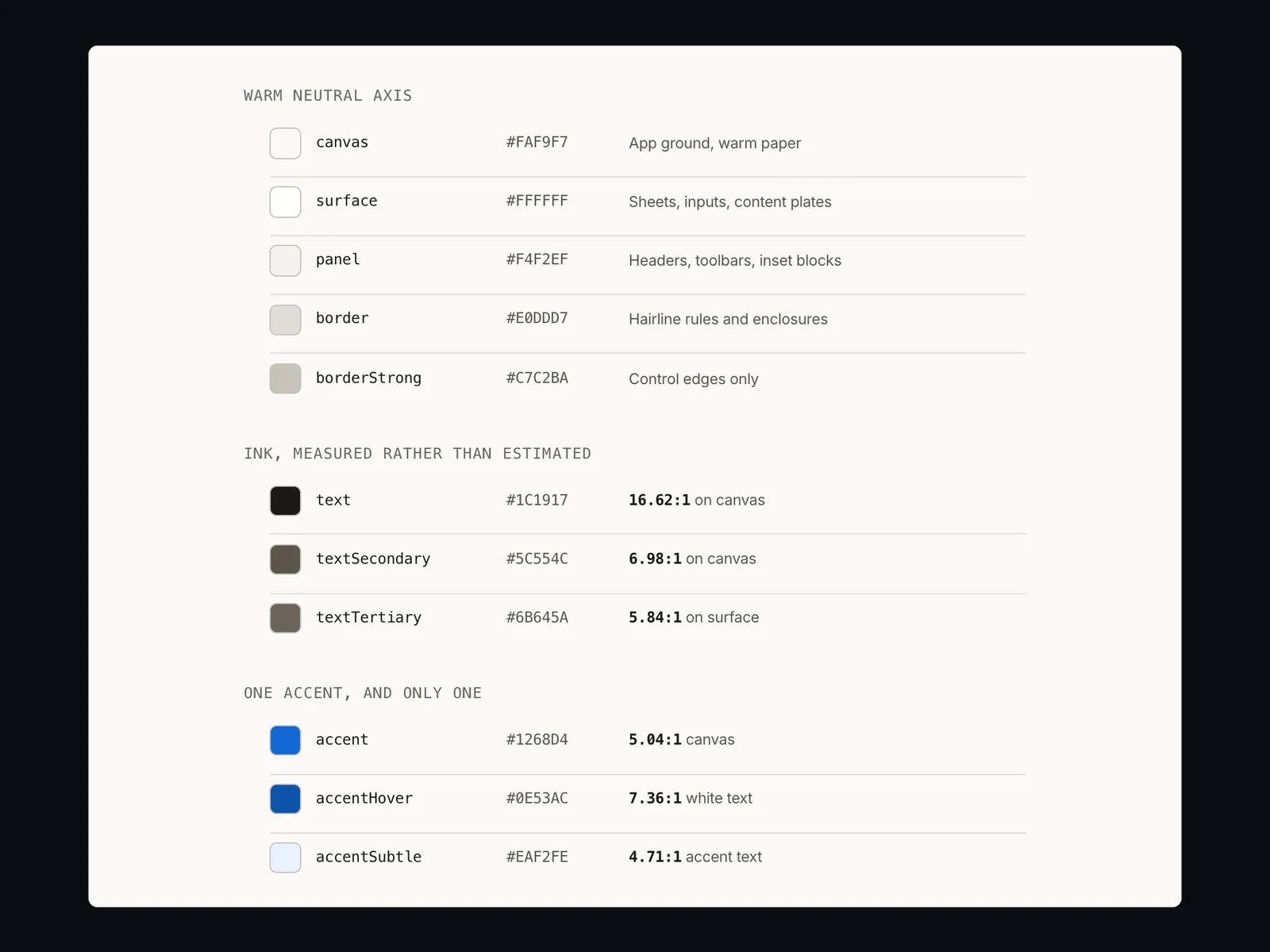
Warm neutral axis
- canvas#FAF9F7App ground, warm paper
- surface#FFFFFFSheets, inputs, content plates
- panel#F4F2EFHeaders, toolbars, inset blocks
- border#E0DDD7Hairline rules and enclosures
- borderStrong#C7C2BAControl edges only
Ink, measured rather than estimated
- text#1C191716.62:1 on canvas
- textSecondary#5C554C6.98:1 on canvas
- textTertiary#6B645A5.84:1 on surface
One accent, and only one
- accent#1268D45.04:1 canvas
- accentHover#0E53AC7.36:1 white text
- accentSubtle#EAF2FE4.71:1 accent text
The neutrals are warm on purpose. A slate greyscale under a blue accent puts every pixel in one cool family and the screen reads as an admin console; the warm ground is what lets the accent register as the one thing meant to be pressed. That is also why there is exactly one accent: if a second colour could be a primary action, neither of them is.
Colour here is not a matter of taste and it is not checked by eye. The palette has its own audit, and the build fails if a pair drops below its floor:
- text on surface17.49:1min 4.5
- text on canvas16.62:1min 4.5
- white on accentHover7.36:1min 4.5
- textSecondary on canvas6.98:1min 4.5
- white on danger6.57:1min 4.5
- textTertiary (placeholder) on surface5.84:1min 4.5
- white on accent5.31:1min 4.5
- focus ring on canvas5.04:1min 3.0
- success on successSubtle4.83:1min 4.5
- accent text on accentSubtle4.71:1min 4.5
All 22 checks pass. The tick on each track is the floor the build enforces.
The script’s own comment says why it exists: guessing hex values that look about right fails this reliably, so the palette is checked instead. Placeholder text is in the audit deliberately. It is the contrast people most often let slide, and it is the text somebody reads while deciding what a field wants from them.
Two faces, one job each
Six steps, fixed — never fluid
- xxl26pxAna PetrovićPage titles, balance figures
- xl20pxAna PetrovićPage title
- lg17pxAna PetrovićScreen and section headings
- md15pxAna PetrovićBody, list rows, inputs
- sm13pxAna PetrovićSecondary text, captions
- xs11pxZAPISI · 2 ZAPISAUppercase section labels, tabular meta
Figures sit in the sans, with tabular numerals
- 4.500,00 RSD
- 12.000,00 RSD
- 800,00 RSD
- 4.500,00 RSD
- 4.500,00 RSD
- 12.000,00 RSD
- 800,00 RSD
- 4.500,00 RSD
The serif is the argument, not the decoration. This product is about written records and its voice is a colleague rather than a clinic administrator; one system sans at every size was the main reason an earlier build read as a generic admin console. The two display cuts ship as separate families because React Native resolves a face by family name rather than by weight, and a synthesised bold smears a serif's stems. Money stays in the sans with tabular numerals, so a column of amounts stops shifting as the digits change. A monospace here would be a costume: it reads as a terminal rather than as a sum somebody is about to discuss with a client.
The scale is fixed rather than fluid, which is a deliberate break from how most web systems are built now. A caseload read at a consistent distance on a consistent screen is not served by headings that clamp with the viewport; growing the window should earn more columns, not bigger type. Past 1024px that is exactly what happens — the register widens and gains columns, and the type does not move.
A detail that only exists because of the runtime: the two display cuts ship as
separate font families rather than as weights of one. React Native resolves a
custom face by family name, not by fontWeight, and asking it for bold on a
serif gets a synthesised one that smears the stems. So fontWeight is never
set on display text anywhere in the product.
The register, not the card grid
Radius scales with the element it is on
The register, not the card grid
A uniform radius everywhere is a costume: sixteen pixels is wrong on a 32px button and right on a full page plate, which is the actual reason current interfaces read as current. Their controls are no rounder than these, their surfaces are simply bigger. Nothing has a resting shadow; only an overlay gets one, with a real offset rather than a halo at zero. The ruled register replaced a card grid that this codebase had, nested, before the rework.
Three structural primitives carry nearly every screen. Section is an 11px
uppercase label over a hairline-ruled group, with more space above a heading
than below it. Row is a 56px minimum target with a hairline under it, and it
is the primary content unit everywhere. Panel is a bordered block used only
where content genuinely needs a boundary, and never inside another one.
One worked example of the rule paying off. The client register at desk width used to carry a phone column, which left roughly 650px of dead space between the name and anything useful. Phone came out; last session and next appointment went in, because a therapist scanning the register wants to know when they last saw someone and when they next will. Status became a 6px dot inside the name cell rather than a filled badge, since status is not an action and a column of saturated pills was contradicting the rule that the only saturated pixels on screen are the ones meant to be pressed.
Every state, including the ones people skip
Button, every state it ships with
- Sačuvaj
- Sačuvaj
- Sačuvaj
- Sačuvaj
- Sačuvaj
- Čuvam…
Field, including the state people forget
- Ime klijentaAna Petrović
- Ime klijentaAna Petrović
- Ime klijentaUnesite ime klijenta
- ZapisZapis je zaključan
The validation message sits under the control rather than inside it, where the eye already is after reading the field. Error is never colour alone, and focus is a solid edge rather than a glow. A pale halo disappears on a bright screen in a daylit room, which is where this product is used. The loading button keeps its width so a slow save does not move the thing under your thumb.
Lists ship loading, empty and error alongside their normal state. Loading uses skeleton rows that match the real row rhythm rather than a centred spinner, so nothing jumps when the data lands. Empty states teach the interface instead of reporting absence.
Motion is 150 to 250ms, ease-out, and conveys state only. There is exactly one authored moment in the product: while dictation is recording, seven bars track the live input level with the centre bars reacting most, so it reads as a voice rather than as a progress bar. The microphone is solid accent at rest and solid danger while recording — the same two colours the rest of the system already uses, doing a job nobody has to learn.
One component, three versions
A system is easiest to judge on a single component that had to change. The booking sheet went through three shapes, and every problem with the first two was found by watching it used rather than by looking at it.
First, a form
Six labelled fields, one per line. It reads like the record it writes, and every question looks equally important.
Then, a composer
Denser, and the labels go. But a title field and a client field now sit four rows apart, each silently clearing the other.
Shippedchosen
The kind is asked first. Two slots swap their contents for a personal hold; every other row stays where it was.
The database had said since an earlier migration that an appointment is either a session with a client or a personal hold with a title, never both and never neither. The sheet left that implicit and let the empty field carry the meaning. Asking outright surfaced a bug the ambiguity had been hiding: validation used to catch a missing client by accident, because an empty client meant "this is a hold" and the title check fired instead. With the kind declared, the two cases stopped covering for each other, and a session with no client would have reached the database and been refused by a constraint. It now fails in the sheet, in Serbian.
The first version was a form: six labelled fields down the sheet, which is how you draw a screen when you are thinking about the row you are about to insert rather than about the person filling it in. Booking a session is not six equal decisions. It is one client, one time, and some details, so the second version dropped the labels for a denser composer with icons and chips.
That bought density and lost clarity. The title field and the client field ended up four rows apart, each silently clearing the other, with nothing to say they were alternatives. Asking the question outright surfaced a bug the ambiguity had been hiding: validation used to catch a missing client by accident, because an empty client meant “this is a hold” and the title check fired instead. With the kind declared up front the two cases stopped covering for each other, and a session with no client would have reached the database and been refused by a constraint. It now fails in the sheet, in Serbian.
Two more problems followed, both about the sheet refusing to stand still.
Switching between the two kinds moved every row below the toggle, because the title field appeared above the time chips while the client row disappeared below them. They are the same question, who or what is this, so they became one row that swaps in place.
Then removing the delivery row for a personal hold made the sheet a row shorter. A bottom sheet is anchored to its bottom edge, so everything above it slid down, including the toggle the finger had just pressed: measured in the browser, it sat at y=1094 as a session and y=1185 as a hold. The fix was not to pad the gap. A hold now takes that slot with a line explaining what a hold is — it blocks the therapist’s own schedule, clients never see it, and the public link cannot book over it. That needed saying anyway, because Lično does not explain itself, and it means the toggle, the chips, the room and the save button sit at identical positions in both states.
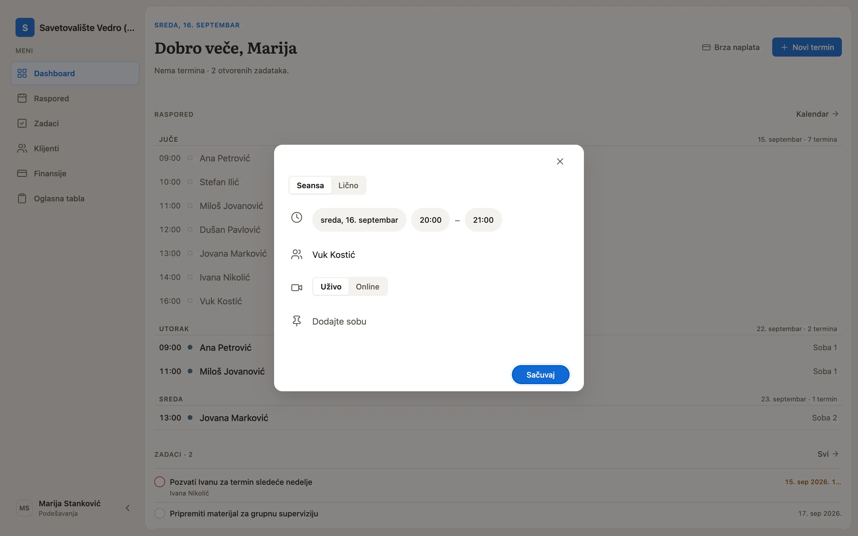
One more, and it is the kind of thing only building the thing teaches you: the
date and time chips were rendering at the right width with nothing drawn inside
them. numberOfLines={1} compiles to a -webkit-box line clamp on React Native
Web, and inside a fixed-height overflow: hidden pill that collapses the text
box to zero height while the width still measures — an empty capsule exactly the
size of the label it was hiding. A chip is sized by its own content, so it has
nothing to clip and no reason to clamp.
What the constraint bought
Working without CSS grid and without pseudo-elements sounds like a tax, and for
the first month it was. A focus ring cannot be an ::after; it is a border and
a shadow on the component itself. A decorative rule cannot be a ::before; it
is a View with a height of one.
What that produces, though, is a visual language that leans on hairlines, row rhythm and spacing rather than on clever boxes — and those are the things that were load-bearing anyway. Every effect that survived the constraint survived because it was doing structural work. The ones that did not survive were decoration I would have kept if the platform had let me.
Shadows went the same way. Nothing has a resting shadow; only an overlay gets one, and it is a real offset with a soft blur rather than a halo at zero. A uniform radius everywhere is a costume for the same reason: sixteen pixels is wrong on a 32px button and right on a full page plate, which is the actual reason current interfaces read as current. Their controls are no rounder than these. Their surfaces are simply bigger.
What I would do differently
I built the system alongside the product rather than ahead of it. That is the right order for one person — a spec written first would have described screens I had not met yet — but it cost me two things.
The dashboard was the one screen that contradicted my own structural rule, and I only saw it once it was in front of me. Half a day of rough layouts would have caught that before a week of code did.
And the contrast audit arrived late. It passes now, but it passed because I went back and moved values, not because the palette was built against the floor from the start. A system that gates its own build is worth having; a system that gates it from day one is worth more, and costs less.